The workshop that I am going to discuss is the creation of the clustermaps. Our team created clustermaps to identify key ideas for our PSA and to isolate concepts that we wanted to address in it. One of my biggest concerns that we addressed while meeting was the communication methods that we plan on using for this project. Doing a group project when group members are away from each other presents its own set of challenges, such as everyone having different schedules. To resolve this concern, the group decided to discuss the important ideas during breakout room sessions and to meet beyond that as needed. Given that the Monday meetings are mandatory, it’s something that the group can plan on.
I’m happy with the topic we picked for this project. We chose older pet adoption and centered it around our current environment- staying at home. We are attempting to make the best of an otherwise gloomy situation by advocating for a positive action. It’s great being able to choose to work on a topic that you are passionate about. I’m also really happy that the group has managed to say in good contact with each other so far given the abrupt change to our academic and personal lives.
Our group plans on following the scheduled deadlines for the remainder of the project and to stick with what we have outlined. We are going to attempt to make this PSA different than a generic pet adoption video. To do this, the group will be using different topics and styles to reach the same ultimate message. I see this PSA going in a more creative direction than what the group usually does. I think we have some room to express our individual styles, and it would be great to see them shine though both with the presentation and the video itself.
This week, I created a presentation using Canva. This is an online site used for creating infographics. I created one for the Automotive Engineering career field.
The reflection: From the list of possible websites, I used Canva. I chose this one because I had heard about it from my peers and heard good things about it. One challenge I faced was how intense the creation screen is. There’s a lot going on and it’s very hard to navigate as a new user. I didn’t like how the templates all had pre-generated graphics yet when you chose those templates, the graphics couldn’t be manipulated or changed to match your own topic in any way. One really useful tool I found was the ability to embed a Canva into Html, which is seen above. Adding media like images or videos is also relatively straightforward which made creating this presentation easier. I’m not certain if I would use this again. There are other websites and services I would like to try out before coming back to this one as I wasn’t totally blown away. One service I’d like to try out is Adobe Spark or Weebly.
UPDATE: Upon publication, it looks like Canva’s embedding service does not work. This is a severe drawback to the service and I would not recommend using it. To see the design, please click the link below the bottom of the grey rectangle or below this paragraph.
This week, I reached out to NHPR asking them to share my PSA. Below is the cover letter.
NHPR 2 Pillsbury St 6th Floor Concord, NH 03301
To the producers of NHPR,
My name is August Murray and I am reaching out regarding an opportunity to broadcast my PSA on your station. I am a member of MRW, a consulting team that has created a PSA about the possibility to reduce carbon emissions within the UNH community. This PSA has the potential to generate real positive change.
I decided to contact you because a New Hampshire based broadcast organization sending a message created by UNH students sends a much stronger and more aligned message compared to a larger organization. A message coming from the University of Tennessee being shared to New England based listeners would have less of a meaning than one coming from a local university. Sharing this message shows listeners that you care about your community and are active within it.
NHPR is a fact-based broadcasting network with little bias. The broadcaster’s affiliations are crucial to consider when broadcasting a PSA because the perception of the PSA can be changed based on who shares it. NHPR is based in New Hampshire which helps strengthen the message to local residents as well as reaching the target audience.
I hope that you will consider sharing the PSA. There is a chance to create a positive climate action if the both of us work together.
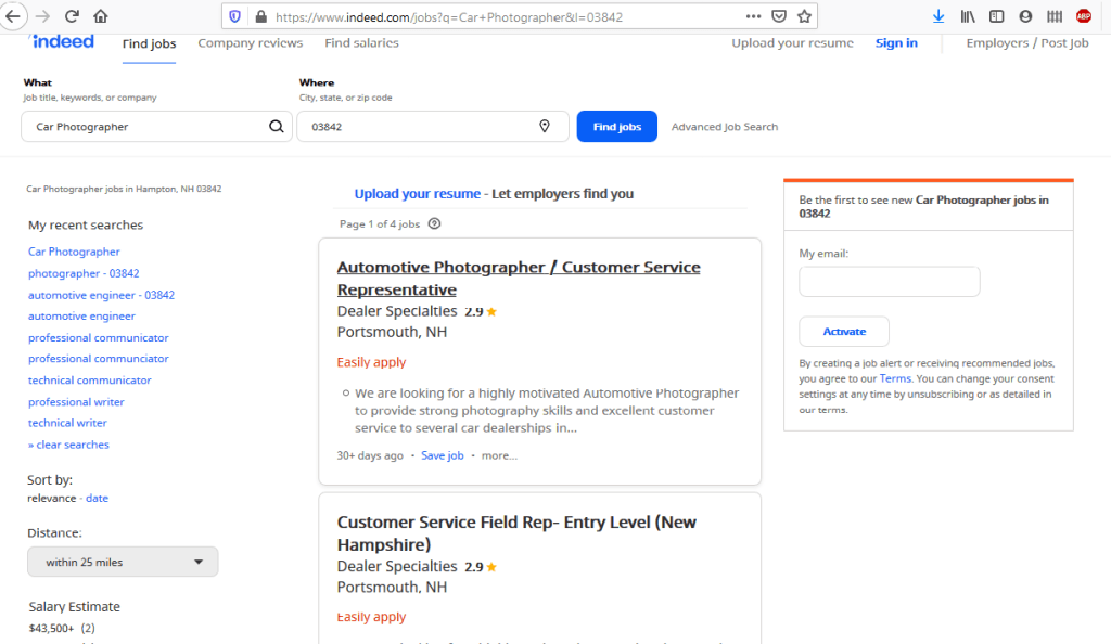
Websites like Indeed.com can be a helpful tool in comparing various job openings.
For this blog post, I searched for an automotive photographer position at nearby car dealerships. I chose to research this job position because it’s something that I am interested in doing as a summer job.
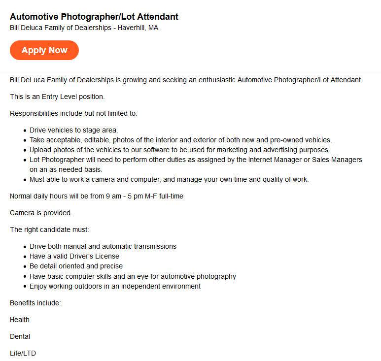
A screenshot of the job description researched for this post.
The company primarily serves its customers. In this case, the customers are people looking for cars to purchase. Since they are not a larger corporation, most managers primarily serve customers as well. The company’s partners are the individual dealerships within the “Family of Dealerships”. They are also partnered with the automotive companies that they sell and repair. I would describe this company’s brand as formal yet outgoing. It seems like their advertisements are geared toward the company having a welcoming yet professional atmosphere.
The company’s logo.
One of the things I admire most about the company is the size. They are a group of multiple car dealerships, which usually means that there is room for growth within the company and that new opportunities may arise. This company is a good fit for me because it’s close to where I live in the summer, I like their expectations for this specific position, and they offer benefits at a starting position. Our interests overlap in them both being centered around the automotive industry. I eventually want to end up working in the automotive field as an engineer, and I think working at a company where my future projects could potentially end up is a great way to get started within the industry.
This week during class, I received feedback from my fellow classmates about my instruction manual and information report. One of the biggest things I took away from those workshops was to be more specific and increase the simplicity of my instruction manual. I realized that there should be little to no assumptions made for an instruction manual to be effective. That means that every step, no matter how seemingly simple, should be covered. For my next draft, I plan on adjusting my manual to include more detailed steps so that anyone without a technical background can use the manual. As of now, I am pleased with how the instruction manual has come out, but I am concerned that as I continue revising that the manual that it will become too long and complex. To me, this is a seemingly simple task but from a non-technical standpoint, this could be a difficult operation so it requires lots of clarification. The challenge there is being able to communicate the process in a condensed manner while still being effective. One failed idea I had was to include how to utilize some of Windows’ features. Another difficulty I have faced while writing this manual is knowing where to end it. After Windows is installed, there are tons of possibilities to illustrate some of the key features that it offers. I’ve realized that as I write this, I need to keep in mind that if someone wants to know how to utilize Windows, then they’ll research how to use Windows, not Boot Camp. This confusion in the ending point of the manual goes hand in hand with confusing the reader. If Windows is installed and Boot Camp is fully setup, then why should they be reading about how to install Microsoft Office? These are some ideas I’ll have to consider as I move forward in my drafts.
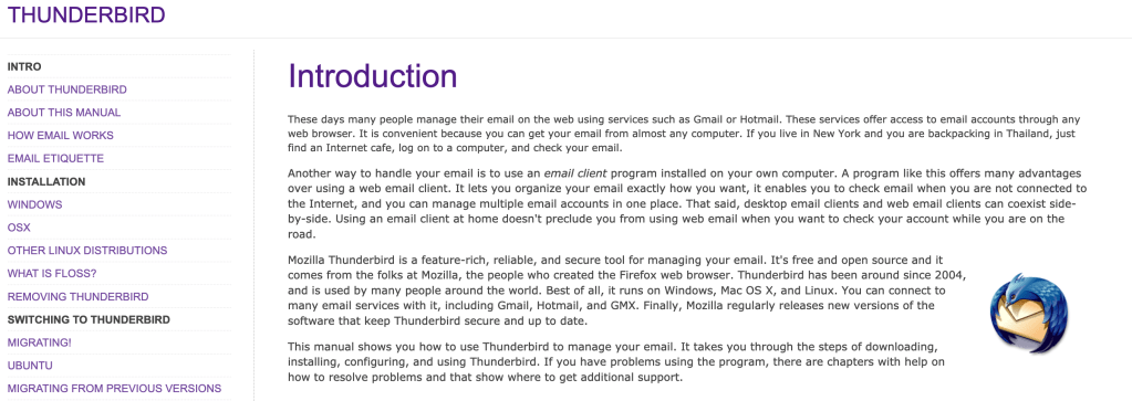
FLOSS Manuals is a free website that contains instructional manuals on how to use free software. Free software usually doesn’t come with as detailed of documentation because it’s usually open-source and the developers are not technical writers. The audience in this case are people that don’t know how to use free software. Based on the depth of content and design choices within each manual, you can assume that the readers are not from a very technical background. An example of this is clear intermediate steps and lots of screenshots throughout the manual. Another one is the simple and clear homepage design.
The purpose of this document is for its readers to gain knowledge on how to setup and use the free software. You can tell this is the primary purpose because the manual is designed around informing and teaching the reader everything there is to know about the software. The written content is generated from the context of the application and the knowledge of the writer.
The beginning of the manual provides an in-depth description of the software.
The manual is designed to answer every question the reader might have about the software. It is extremely detailed and simplifies lots of complex terms that a reader may get confused by. It is organized in chronological order from setup to future updates. The standard features of the content are covered thoroughly in this manual. This is done because in order to properly use the software, someone should know how to use all the standard features. There are additional features outlined in most of the software tutorials. Many of them are how to install additional features to the software and what some of those add-ons may be.
Example 1: “Mozilla Thunderbird is a feature-rich, reliable, and secure tool for managing your email.” This is an introductory sentence in a paragraph describing Thunderbird and some of its features. I find this sentence effective because it introduces the software in a good depth without using any technical terms. It does a very good job of summing up why someone should use this software without the need to understand a lot about software.
Example 2: “Think of the Menu Bar as your entry point into Thunderbird’s basic commands and functions.” This sentence is introducing some of the basic features of Thunderbird. I like this sentence because although almost all software has a menu bar, they all have varying sub-menus. Clarifying where the go-to location is for software is a very important key in understanding how to operate it.
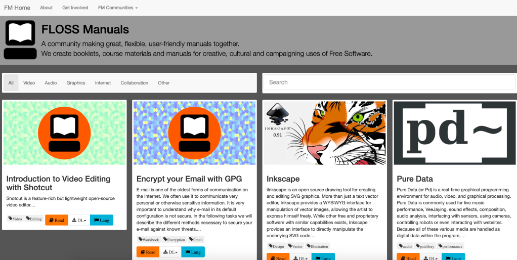
Example 1 – The homepage
The homepage is a great example of an effective design. It is designed for someone that may not know how to navigate a website and supplies all the information in a very simple manner. The manuals can be sorted or searched for, and both of those options are very easily accessible at the top of the page.
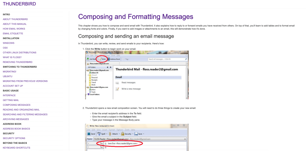
Many manuals utilize screenshots as an effective communicative tool.
Another example of effective design is the large number of screenshots from the software used in the manual. Visuals combined with descriptive text is an extremely effective method of instruction. Personally, I find a manual with images describing what I should be seeing is far easier to use than one without them.
If I were the author of this manual, I would have done a couple of things differently. The biggest thing I would change is the design of the website. It looks extremely outdated, and many of the screenshots within the manuals are from old operating systems. If the manual isn’t up to date with the latest updates, it is far less effective. Another thing I would have done differently is streamline the homepage and website navigation buttons. For example, if you click on the “FLOSS Manuals” title in one of the manuals, it takes you to the editing page instead of back to another manual. Getting back to the original manual homepage is actually somewhat difficult and this could deter lots of readers.
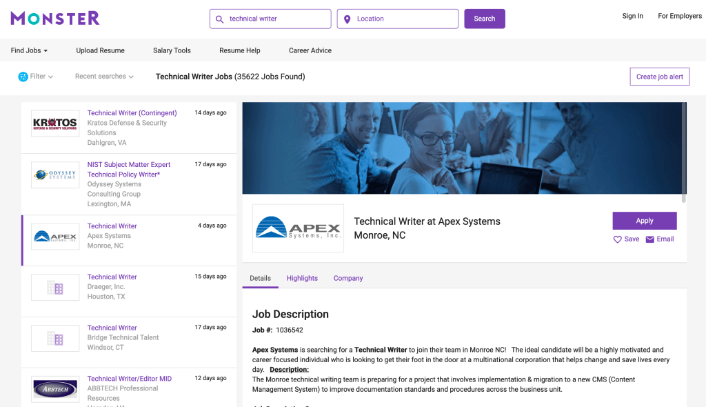
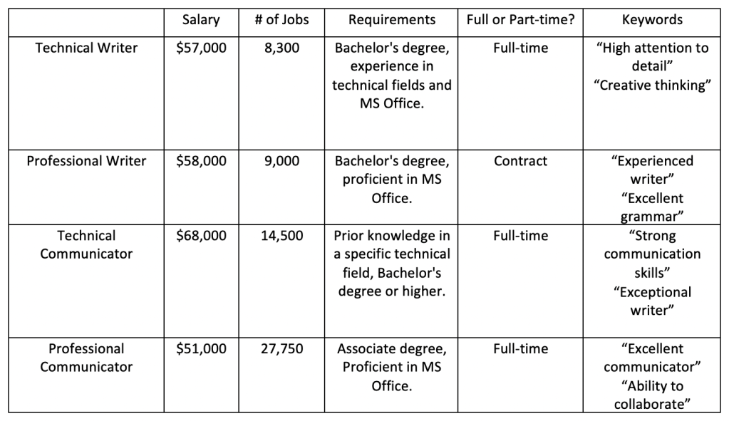
Utilizing job search sites like Monster.com can be a useful tool in comparing various job titles.
I’m exploring the differences between the following four terms: – Technical writer – Professional writer – Technical communicator – Professional communicator
A screenshot showing the typical process researching a job title.
In order to generate a table comparing these four job titles, I researched each position on job search sites like Indeed.com and Monster.com. These sites are helpful tools to find the typical requirements for a position as well as expected wages. Below is a table containing information I found from these sites:
A table comparing four different job titles.
Based on the information above, here are my definitions for each job title: Technical Writer – A technical writer serves as a type of translator to take complex technical information and communicate it in a way such that anybody could understand it. They ensure a proper understanding of a product by simplifying descriptions for someone from a non-technical background.
Professional Writer – A professional writer is someone who creates content on behalf of a client, such as a company, to be published on various outlets. Professional writers must have a solid understanding of the client’s interests and goals in order to publish accurate content. Technical Communicator – A technical communicator is someone who has a strong knowledge background in a certain technical field, such as 3D printing or medical technologies. They may provide technical support to clients or create aids to help customers understand the operation or design of a product on behalf of the company.
Professional Communicator – A professional communicator is someone who oversees the disclosure of information to clients on behalf of an organization of company. They typically work face to face with clients to confirm the correct interpretation of pertinent information.