FLOSS Manuals is a free website that contains instructional manuals on how to use free software. Free software usually doesn’t come with as detailed of documentation because it’s usually open-source and the developers are not technical writers. The audience in this case are people that don’t know how to use free software. Based on the depth of content and design choices within each manual, you can assume that the readers are not from a very technical background. An example of this is clear intermediate steps and lots of screenshots throughout the manual. Another one is the simple and clear homepage design.
The purpose of this document is for its readers to gain knowledge on how to setup and use the free software. You can tell this is the primary purpose because the manual is designed around informing and teaching the reader everything there is to know about the software. The written content is generated from the context of the application and the knowledge of the writer.
The manual is designed to answer every question the reader might have about the software. It is extremely detailed and simplifies lots of complex terms that a reader may get confused by. It is organized in chronological order from setup to future updates. The standard features of the content are covered thoroughly in this manual. This is done because in order to properly use the software, someone should know how to use all the standard features. There are additional features outlined in most of the software tutorials. Many of them are how to install additional features to the software and what some of those add-ons may be.
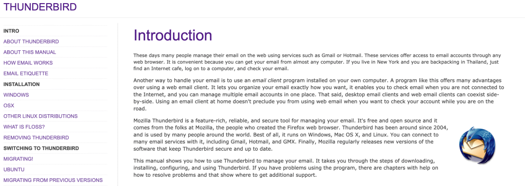
Example 1: “Mozilla Thunderbird is a feature-rich, reliable, and secure tool for managing your email.” This is an introductory sentence in a paragraph describing Thunderbird and some of its features. I find this sentence effective because it introduces the software in a good depth without using any technical terms. It does a very good job of summing up why someone should use this software without the need to understand a lot about software.
Example 2: “Think of the Menu Bar as your entry point into Thunderbird’s basic commands and functions.” This sentence is introducing some of the basic features of Thunderbird. I like this sentence because although almost all software has a menu bar, they all have varying sub-menus. Clarifying where the go-to location is for software is a very important key in understanding how to operate it.
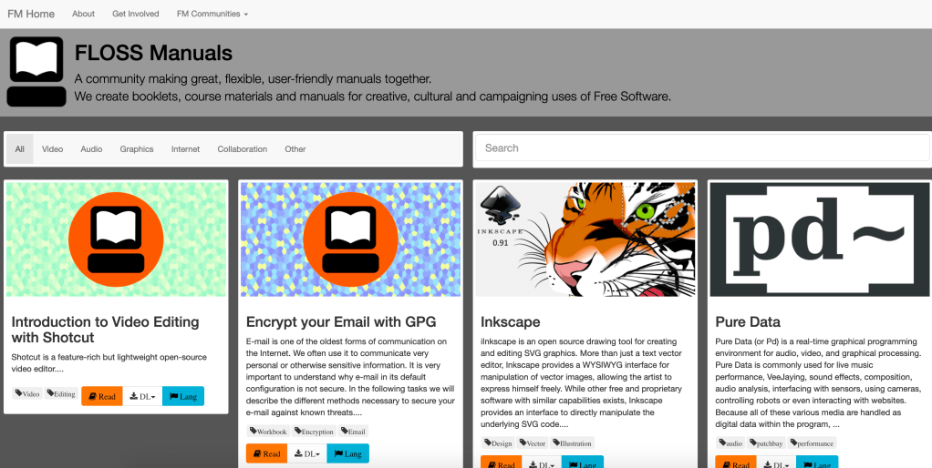
The homepage is a great example of an effective design. It is designed for someone that may not know how to navigate a website and supplies all the information in a very simple manner. The manuals can be sorted or searched for, and both of those options are very easily accessible at the top of the page.
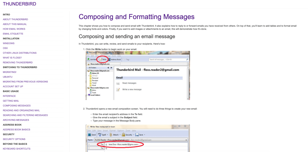
Another example of effective design is the large number of screenshots from the software used in the manual. Visuals combined with descriptive text is an extremely effective method of instruction. Personally, I find a manual with images describing what I should be seeing is far easier to use than one without them.
If I were the author of this manual, I would have done a couple of things differently. The biggest thing I would change is the design of the website. It looks extremely outdated, and many of the screenshots within the manuals are from old operating systems. If the manual isn’t up to date with the latest updates, it is far less effective. Another thing I would have done differently is streamline the homepage and website navigation buttons. For example, if you click on the “FLOSS Manuals” title in one of the manuals, it takes you to the editing page instead of back to another manual. Getting back to the original manual homepage is actually somewhat difficult and this could deter lots of readers.
